01
Driver
Client
Driver
Year
2018
Role
Product Design
Credits
Lotte Peters, Erika Nicks, Michael Hoang, Liz Nunley, Sheldon Lotter & The Driver team
The cancer care system is broken. Today, a cancer patient has to enter a physical hospital and interact with a doctor to receive their treatment options. The options they are given are limited to treatments that are known to that specific hospital or to that particular doctor. This means that there might be other treatments out there that these patients never hear about. Treatments that can save their life.
Driver is a platform that connects cancer patients to cancer treatments all over the world.
What does Driver offer?Driver's offering consisted of three primary services. These services become the following product offering:
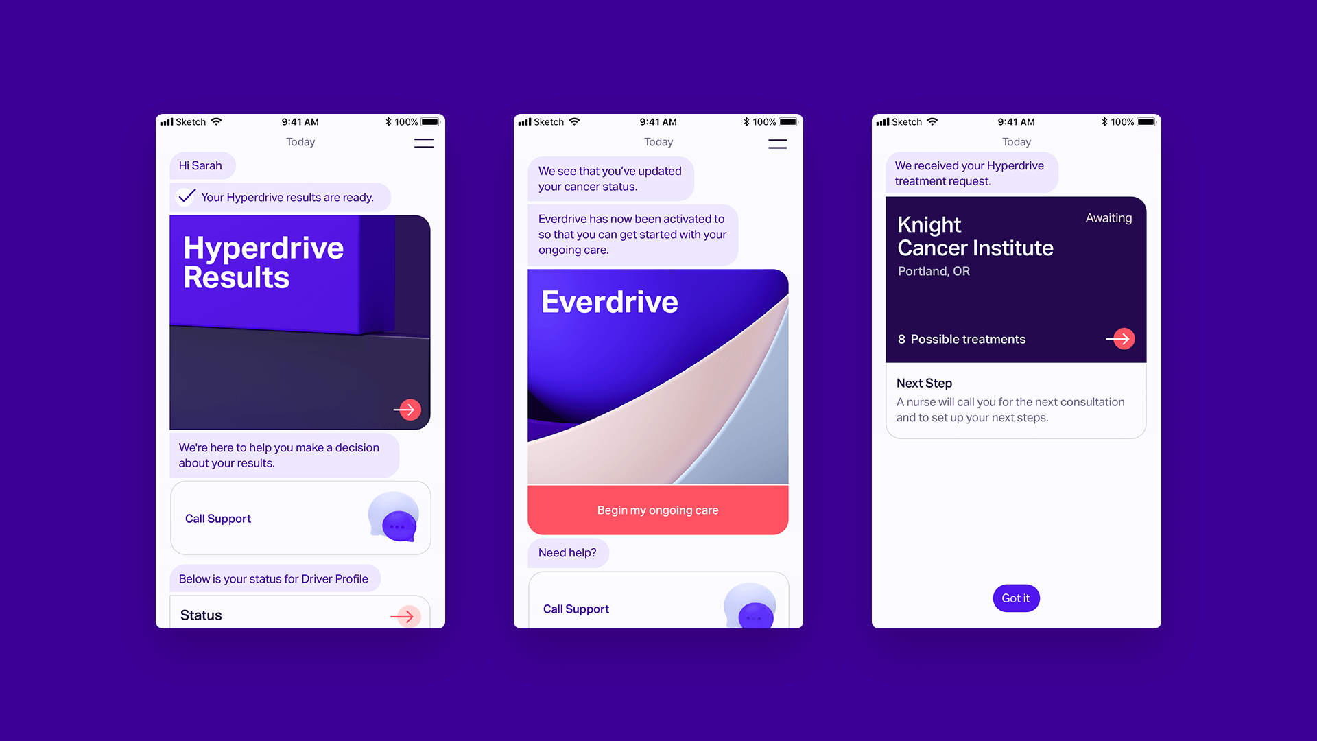
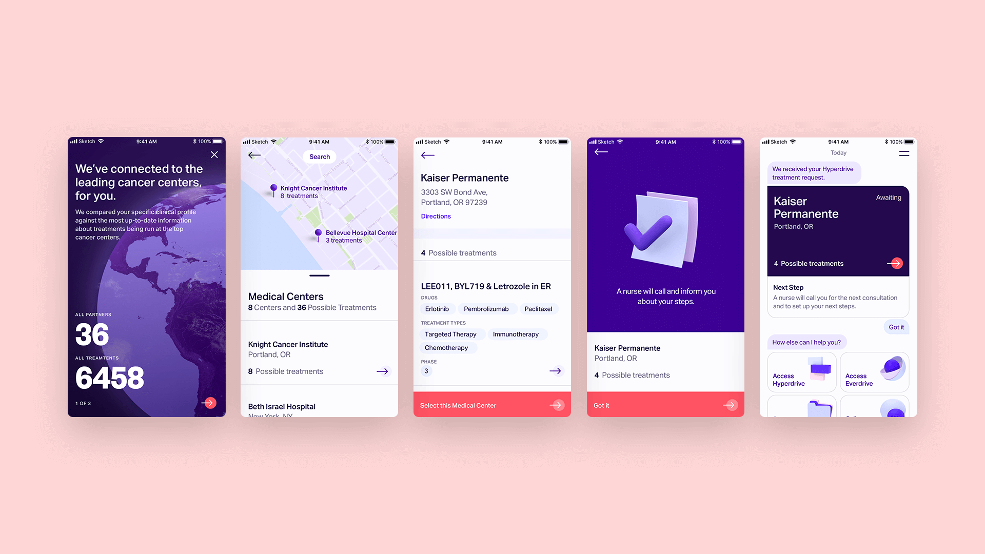
Hyperdrive — Matching patients to cancer treatments around the world based on their medical profile. This gives them access to over 3800 treatments.
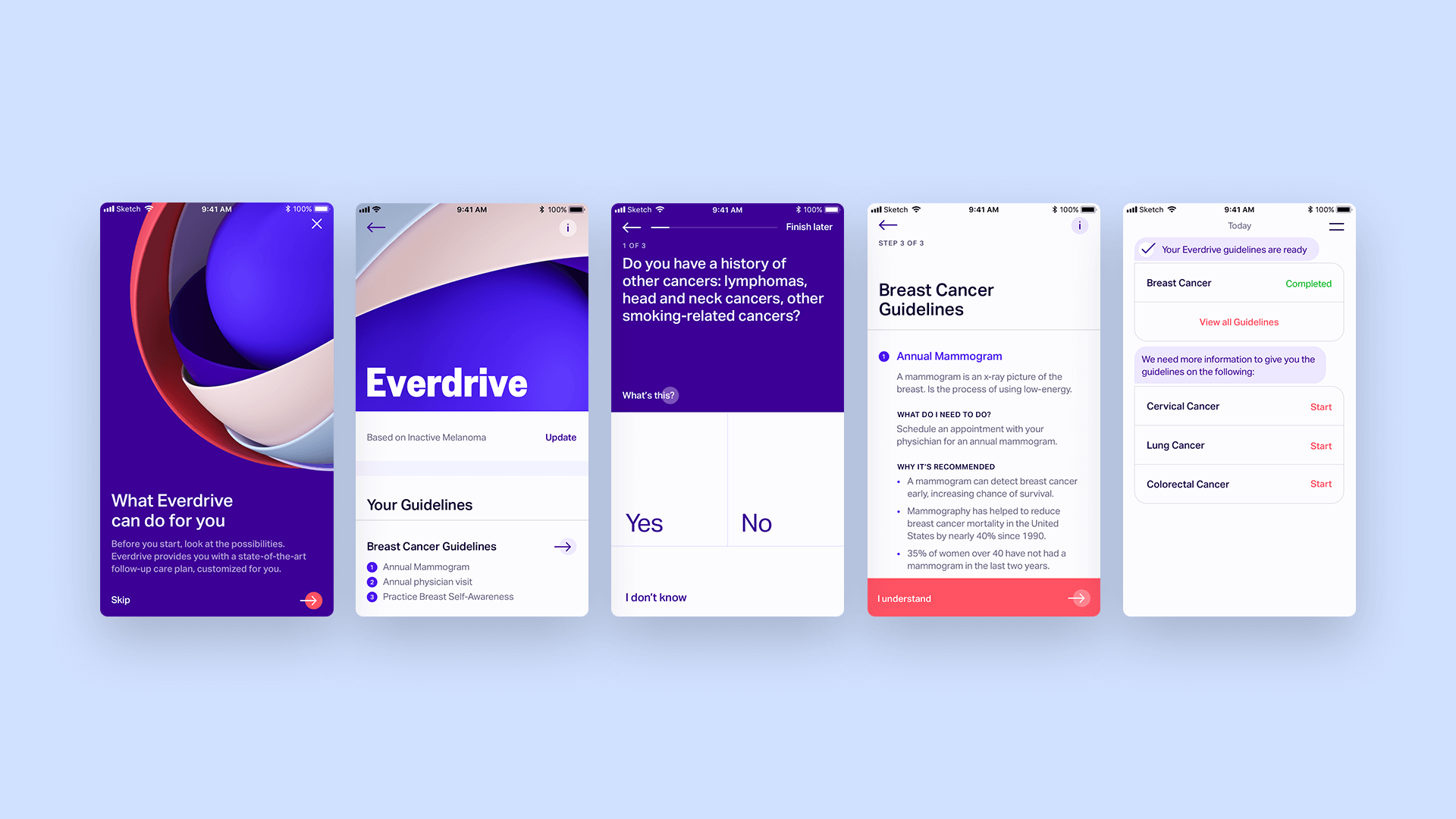
Everdrive — Setting up a preventative care plan for patients based on their medical history.
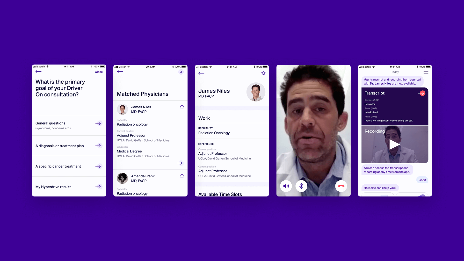
DriverOn — Allowing patients to be able to talk to a doctor based on their needs anytime, anywhere.
We partnered up with Driver to make all three services come to life in the form of an Android & iOS app.
Who is the user?People with cancer, primarily in USA and China. We found out that cancer patients often are scared, but also very much on top of things. They are well-read and very driven in their process of surviving cancer. Their fear turns into motivation. They are also willing to spend money and do whatever it takes to get healthy again. Patients want to be in control, to know what is going on. Our focus was the patients who had the financial means get the best treatment. This is because initially the Driver app would not be covered by insurance, but Driver was working hard to change that.
What are we trying to solve?The world of cancer is complex with a lot of information that isn’t so easily digestible, resulting in a lot of patients feeling lost and helpless throughout their process of surviving cancer. How might we help patients navigate this terrain with confidence, ease and always knowing what their next step is?
What we didBased on the insight that cancer patients experience a high control need and get overwhelmed by information we decided that we needed to create a guided experience where the patient always know what their next step is, but at the same time always have an excellent overview with the possibility to learn more if the patient wants to.
We wanted the app to be proactive where the patient is guided through their next steps and what they need to do. We didn't want to leave space for misunderstanding or ambiguity. At the same time, we wanted to allow patients, if they wish to, to read more and dig deeper into all the information that was available.
To achieve this, the user interacted with various interfaces of the app: the Action Board, Wizard & Wallet (names we used internally).
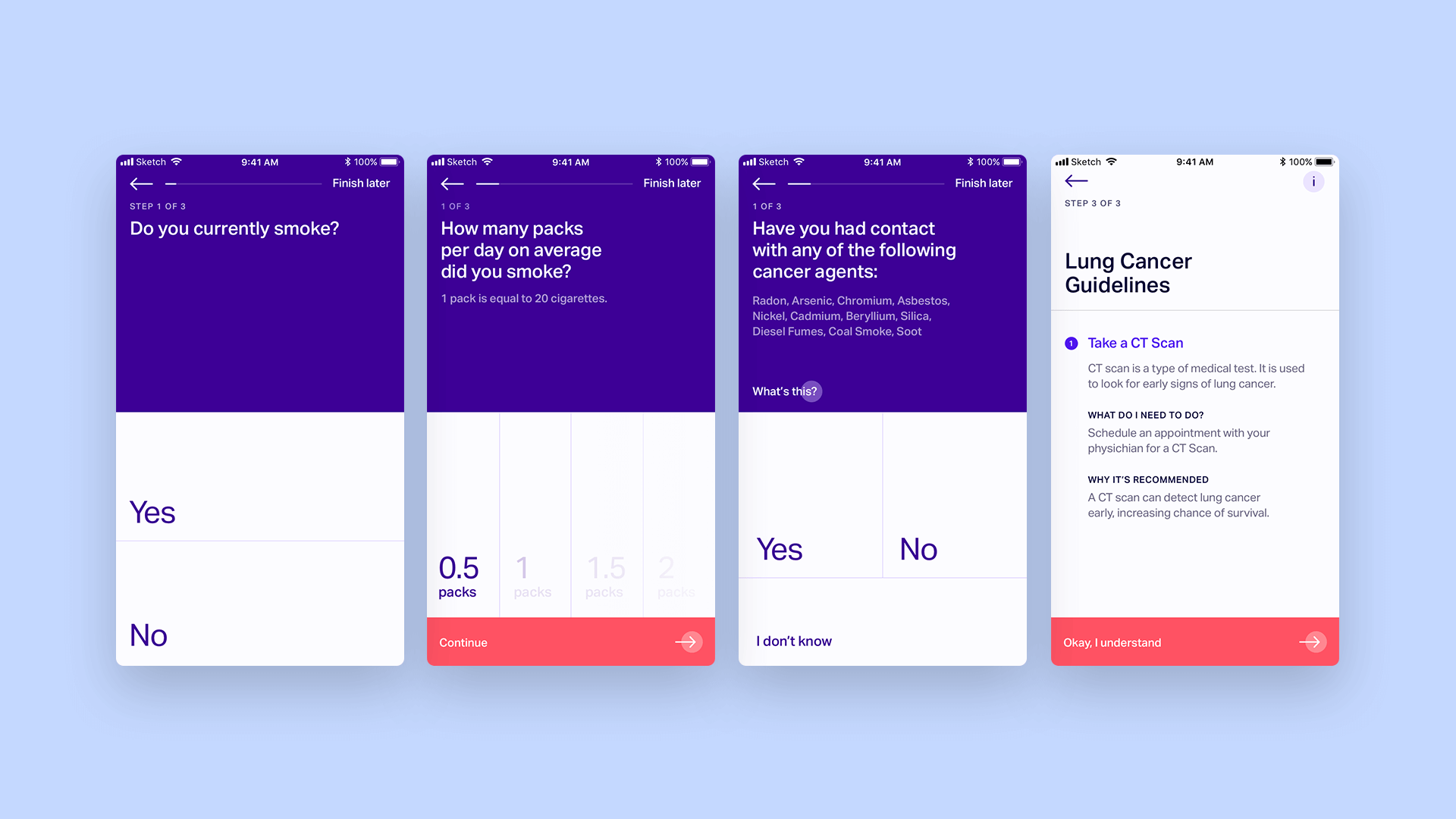
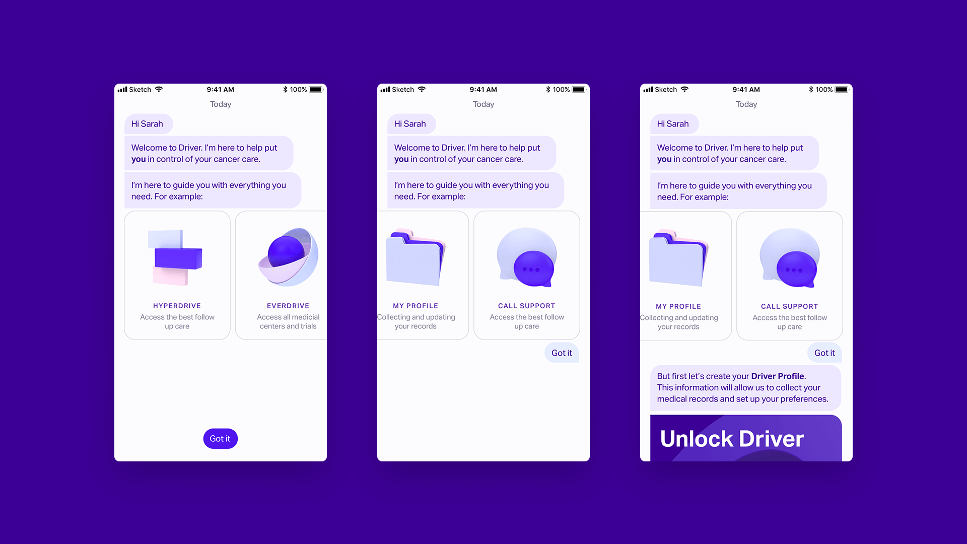
Action board — A guided experience where the patient always know what's next.The action board is the start of the experience where patients land every time they open the app. Driver aimed to guide the user in a personable way by presenting focused and digestible information using the appearance of conversational UI. The action board is importance-focused meaning it would show the most critical or required actions that the patient needs to take in respect to the three features (Hyperdrive / Everdrive / Driver On). The user is able to jump directly to the content that requires their attention, and once the user is finished, they are taken straight back to the Action Board with a little recap of what they just did. This is to bridge the conversation between the Action Board and the actions they took elsewhere in the app (Wizard and Wallet).
The idea with the action board is to create a place for focus and guidance.
Wizard — A place to complete tasks.The Wizards are usually accessed via the Action Board, and that gives the user a focused view to complete a task. These tasks are in respect to any of the offered features from "start an Everdrive assessment" to "start the matching process." Because multiple steps might be required to complete an action, it was important to create this Wizard experience and take the user away from the Action Board and into a full-screen, focused flow.
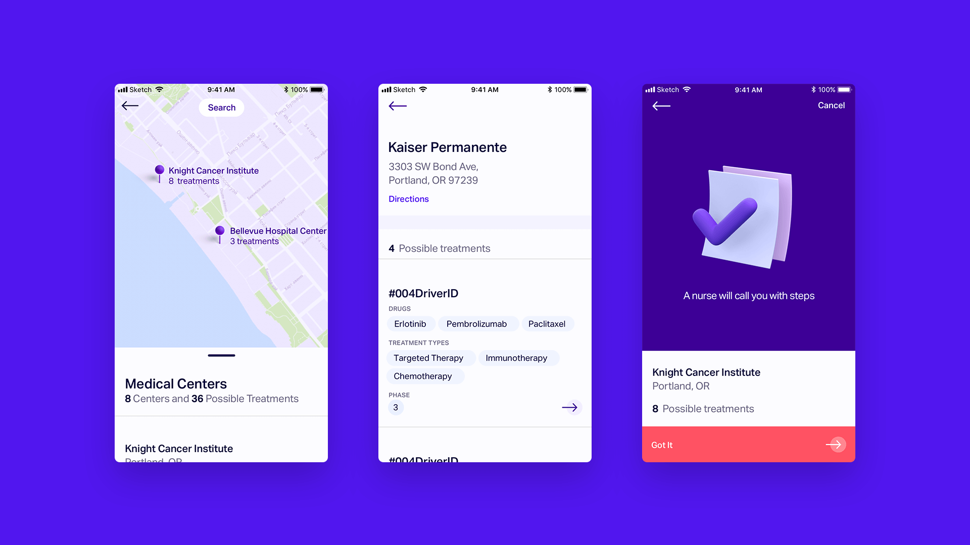
Wallet — All medical information in one organized place. A place for overview.Despite Driver's goal to provide a guided experience using the Action Board and Wizard, we knew that there is a lot of information around cancer and treatments that the patient might want to review at different moments. The Wallet is a place where the patient can access all info themselves whenever they want. The Wallet consists of one dashboard per feature. Through these dashboards, the patient can access all actions and information.
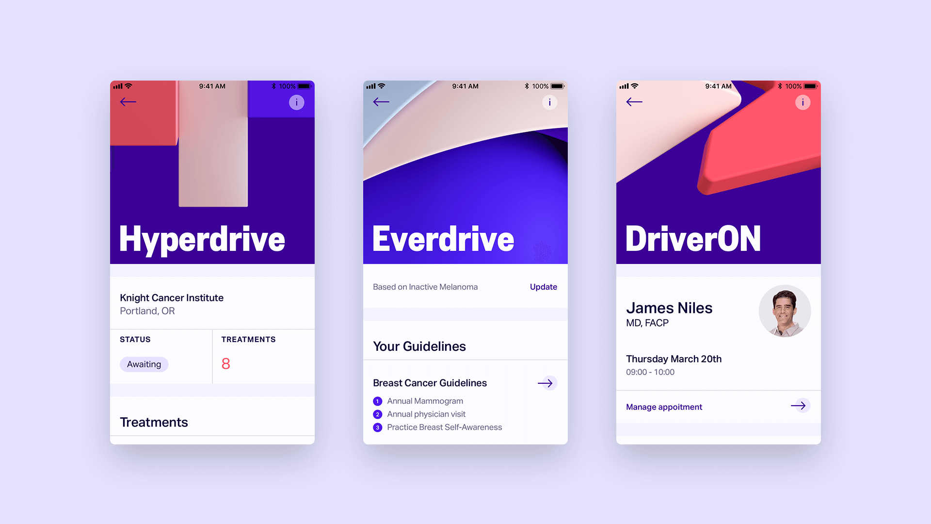
Hyperdrive
Everdrive
DriveOn
How we workedDuring the whole Driver project, we worked as an integrated part of Driver. This meant we had to work with a lot of continuously changing business goals and requirements. It was a very iterative process where we often had to drop our ideas and go back to the drawing board.
My role:UX (creating user flows & wireframes) UI (Design production & prototyping) and hand-over to development & QA.
What I learned?I realized how passionate I am to create products that truly add value to people's lives. Seeing the first response we got from patients was extremely rewarding and it keeps me motivated to do more and better. The importance of shipping an MVP as quick as we can to try to validate more and faster.
—
As a result of Driver running out of money and being unable to get another round of funding, the company had to shut down just a few weeks after launch. This subject is very close to my heart, and I hope the Driver team can recover and continue working on this vital mission. A mission that can one day potentially find the cure to cancer.